In this digital era, effective communication hinges on compelling visuals. This article provides a comprehensive guide to creating engaging infographics in 2024.
From selecting an ideal infographic template design to understanding audience dynamics, the piece delves into each step of the process. It also covers the latest trends and tools in infographic design.
The goal is to equip readers with the knowledge to create clear, appealing visuals that resonate with their intended audience.
Key Takeaways
- Infographics are effective tools for visual communication and can be used in various industries such as marketing, consulting, and education.
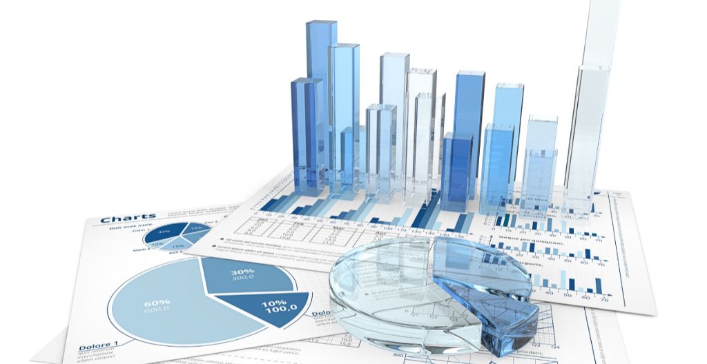
- Infographics make complex information easy to digest and can provide quick overviews, explain processes, and summarise content. They are very important in technical communication.
- A good infographic presents complex data in a concise and highly visual way, using elements such as numbers, headers, color, white space, pictures, and charts to control flow.
- When creating an infographic, it is important to choose the right template, identify the target audience, collect relevant data, customise the design, and ensure the infographic is visually appealing and easy to understand.
Understanding the Basics of Infographics in 2024
In our 2024 discussion on understanding the basics of infographics, we will delve into the evolution of this powerful visual communication tool and its increasing significance in data-driven storytelling across diverse industries.
Infographics, initially a simple infographic chart, have transformed into complex, interactive, and dynamic visuals. The role of an infographic generator has become indispensable in creating such striking visuals. These generators offer a plethora of design options and templates, making it easier for individuals from various sectors to create compelling infographics.
The seamless integration of data and design elements in an infographic chart enhances the clarity of the presented information. As we continue to thrive in an era of information overload, the use of infographics as a succinct, visually-engaging tool for conveying complex data will undoubtedly persist.
Choosing the Right Tools for Infographic Creation
Choosing the right tools for infographic creation is an essential step for effective visual communication, and it requires careful consideration of the tool’s features, ease of use, and compatibility with your design needs. A comprehensive software comparison can assist you in identifying the best fit for your project.
Below is a comparison of some popular infographic creation tools:
| Tool | Noteworthy Features | User Experience |
|---|---|---|
| Canva | Numerous templates, drag-and-drop elements | User-friendly, intuitive |
| HubSpot | Customisable templates for PowerPoint | Simplified, professional |
| Piktochart | Diverse data visualisation options | Interactive, easy-to-use |
| Snappa | Ready-made templates, drag-and-drop builder | Streamlined, efficient |
Each tool comes with unique strengths, and the choice largely depends on the specific requirements of your infographic design project.
Step-by-Step Guide to Designing Your Infographic
Following a systematic approach to designing your infographic can significantly enhance its effectiveness and impact, and understanding each step of the process is paramount to ensuring a successful outcome.
Begin with defining the purpose and target audience of the infographic. This is followed by collecting relevant data and content, then choosing an appropriate template (for example, list infographic definition).
Customisation of the template should be done with careful attention to visual aesthetics and readability. Always include a footer with sources and your logo for authenticity and brand visibility.
Once completed, sharing on various platforms will maximise reach. Remember to submit to infographic directories, and consider reaching out to influencers or industry experts for promotion to increase visibility. Paid advertising might also be an option.

Innovative Infographic Designs and Trends in 2024
Exploring the innovative infographic designs of 2024 reveals a shift towards dynamic content and interactive elements. It also underscores the importance of mobile optimisation in an increasingly digital world. With the rise in mobile users, infographic designs have become compact, concise, and easy to comprehend on smaller screens. More emphasis is now on the use of dynamic content that allows for user interaction, enhancing engagement and information retention.
Furthermore, the use of augmented reality (AR) in infographics is gaining momentum, transforming static graphics into interactive experiences. Data storytelling is another 2024 trend, as infographics shift from mere data presentation to narrating compelling data-driven stories.
These emerging trends illustrate the evolution in the definition of technical illustration and infographics, aligning with technological advancements and changing user preferences.
Effective Promotion and Distribution of Your Infographics
Understanding the nuances of digital marketing and leveraging social media platforms for the distribution of your infographics are pivotal in ensuring their effective promotion.
The potency of infographics lies in their ability to condense complex data into a visually engaging form. However, without strategic distribution, they may not reach their intended audience.
Utilising digital marketing strategies like SEO, email marketing, and sponsored content can enhance visibility. Social media platforms, with their vast user base, provide an ideal channel for distribution.
Tailoring the infographic to each platform’s specific format can optimise engagement. In addition, collaborations with influencers or industry experts can amplify reach.
Lastly, submitting to infographic directories can also increase exposure and traffic.
Sign up for our Life Sciences Newsletter and boost your engagement with HCPs
Frequently Asked Questions
What Are Some Common Mistakes to Avoid When Creating Infographics in 2024?
Common mistakes to avoid when creating infographics include overcrowding with too much information, using irrelevant visuals, poor data representation, lack of source citation, and not considering the target audience’s needs and understanding. Here’s some food for thought: conceptual design meaning.
How Can AI and Machine Learning Be Utilised in Creating More Effective Infographics?
AI and machine learning can significantly enhance infographic creation by analyzing large data sets, identifying trends, and generating visual representations automatically, thus making infographics more accurate, insightful, and time-efficient to produce.
What Are the Ethical Considerations When Gathering and Presenting Data in Infographics?
Ethical considerations in infographics involve accurate representation of data, respecting privacy and copyright laws, avoiding misleading visualisations, and ensuring transparency about data sources and manipulations to uphold integrity and trustworthiness of the information presented.
How Do You Measure the Success or Effectiveness of an Infographic in 2024?
The success of an infographic in 2024 can be measured by its reach, engagement, and impact. Key metrics include views, shares, time spent, actions taken after viewing, and feedback received, all tracked through various analytics tools.
How Can Infographics Be Optimised for Mobile Viewing and Accessibility in 2024?
In 2024, optimising infographics for mobile viewing and accessibility involves responsive design, clear font sizes, concise text, and a vertical layout. Ensuring color contrast and including alt-text also enhances accessibility for visually impaired users.
Conclusion
In conclusion, the importance of infographics in the digital age should not be underestimated. They are a powerful tool for communicating complex information in an engaging, visually appealing manner.
Selecting the right tools, understanding design principles, following current trends, and effectively distributing the finished product, all contribute to the success of an infographic.
As visual content becomes increasingly necessary, mastering the creation process of compelling infographics is an essential skill.