The process of creating quality infographics
SciencePOD infographic created for Elsevier Chemistry. Credit Elsevier at
Alice Rolandini Jensen, SciencePOD writer
Science that makes an impact reaches many people – in the scientific community and beyond. Getting complex concepts and results out there in a way that captivates and inspires is challenging. And with competing discoveries just a click or a swipe away, what can scientists (and science publishers) do to increase the reach of their work?
One effective way is with infographics. Infographics can do something text alone cannot – quickly catch the attention of thousands of eyes! With images and just a few words, infographics can show the overall results or key message of a scientific paper. But they need to be eye-catching and intriguing, to entice people on Twitter, LinkedIn or Instagram, for example, to click and find out more.
Creating quality infographics from a scientific paper
As a science writer and creator of quality infographics, my task is to condense a scientific paper – that may have taken years of work by many people – into a picture. Having a background in science (in this case, chemistry) not only helps me understand scientific research papers, but it also helps me ask the right questions of researchers and scientists. When researchers confirm the most important aspects of their work, this helps me decide on an image, or series of images, to best convey their findings. I take a minimalist approach to text and rely as much as possible on an image to catch the eye and guide the onlooker.
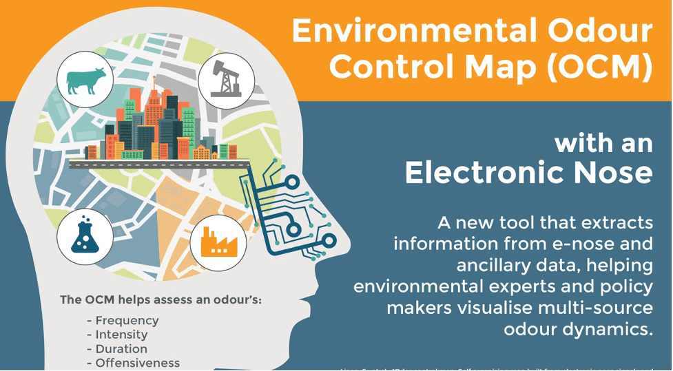
Take, for example, the infographic on an environmental odour control map that I worked on for SciencePOD. The main point to get across was the idea that an ‘electronic nose’, works much like our own. This is something people can relate to and understand. Therefore, I chose to include a human head but with circuitry in its nose. This leads the ‘brain’ to create a map of odours in different geographic areas. The text in the infographic is then used to add further detail and basic explanation of the core image.
Moving from concept to actual design can be challenging. To get my ideas across to the designer, I often draw a quick sketch and include sample images. What follows is a productive iterative process through which the SciencePOD designer brings my infographic concept to life! We are a team of experts working towards the same goal. It is also important to ensure that the scientists behind the research are happy with the results. A researcher will often make very useful suggestions on the wording of the text for an infographic, for example.
Throughout the process, I always keep the target audience in mind. Often this means making sure that the image and text work well together and do not become overly technical so as to attract a wider audience and maximise the impact of the quality infographic. Creating quality infographics like this one, allows researchers and publishers to reach more people and to do so through more media channels. It’s an important way to get work noticed and understood in this fast-paced technological era.